Sally Hansen Color Foils…
| Purchased by Me |
Just when I thought I could actually go on a no buy, everyone comes out with these amazing collections forcing me to buy them. And this new Sally Hansen Color Foils collection is no exception. I originally picked up 5 of the colors because I thought the other ones were too similar to the Essie Mirrored Metallics , but /u/smapte (reddit) pointed out that Sterling Silver was a near dupe of OPI Push & Shove I had to pick it up, and the two golds just happened to end up coming home too 😉 .
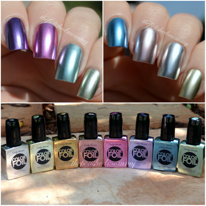
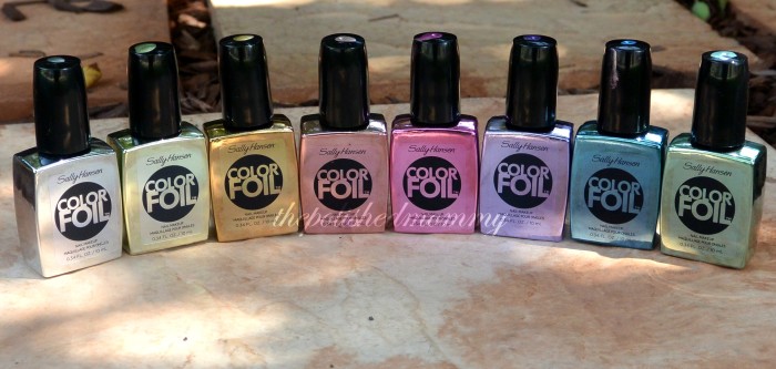 (L to R) Sterling Silver, Yellow Gold, Liquid Gold, Rose Copper (also labeled Pink Copper), Titanium Flash, Purple Alloy, Cobalt Chrome, Minted Metal
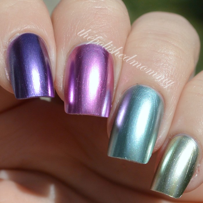 (L to R) Purple Alloy, Titanium Flash, Minted Metal, Yellow Gold
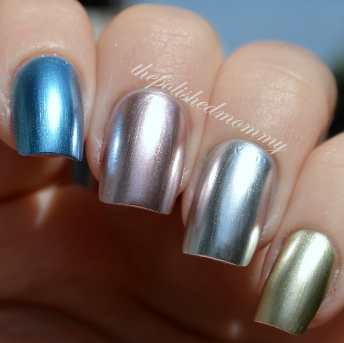 (L to R) Cobalt Chrome, Rose Copper, Sterling Silver, Liquid Gold
All of the above swatches are 2 coats no base or top coat and I have to say they are very chromey. But with their chromey goodness comes a price, the formula, it (how to put this nicely)…sucks. If you’re not careful when applying these, or you try to apply them over the wrong base coat, these can streak and patch like crazy. The day I got them I was so excited to try them I swatch it over my day old Duri Rejuvacote base coat and OMG the horror. I was about to forsake these and only using them for stamping when someone suggested using them without a base coat. The result was sooooo much better, but no base coat = chip city =( .
So I began to test them…
Sterling Silver
Base coat test, no top coat.
(L to R) no base coat, Nail Tek II Foundation (dries matte), Orly Top to Bottom, Sally Hansen Insta Dri (red bottle)
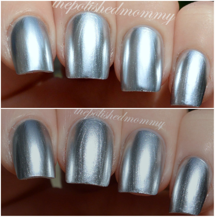 Top Coat test, over previous base coats.
(L to R) Sally Hansen Mega Shine, Orly Polished, Orly Top to Bottom,Sally Hansen Insta Dri (red bottle)
Conclusion: They work best without a base coat, or if you do use one it has to be shiny. Applying these over a matte base coat streaks them and they dry streaked, losing that smooth chrome finish. I will note that over Sally Hansen Insta Dri it became slightly more mirrored, not a huge difference but it was noticeable. As for top coating, they don’t look horrible once you apply top coat but topcoat tends to accentuate all of the brushstrokes that previously looked smooth.
How do they compare?
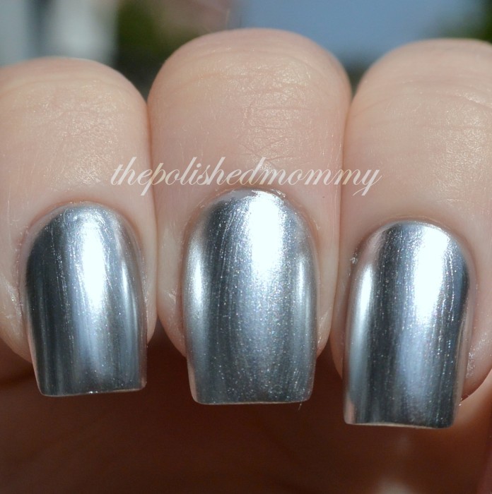 (L to R) Sally Hansen Sterling Silver, Essie No Place Like Chrome, OPI Push & Shove
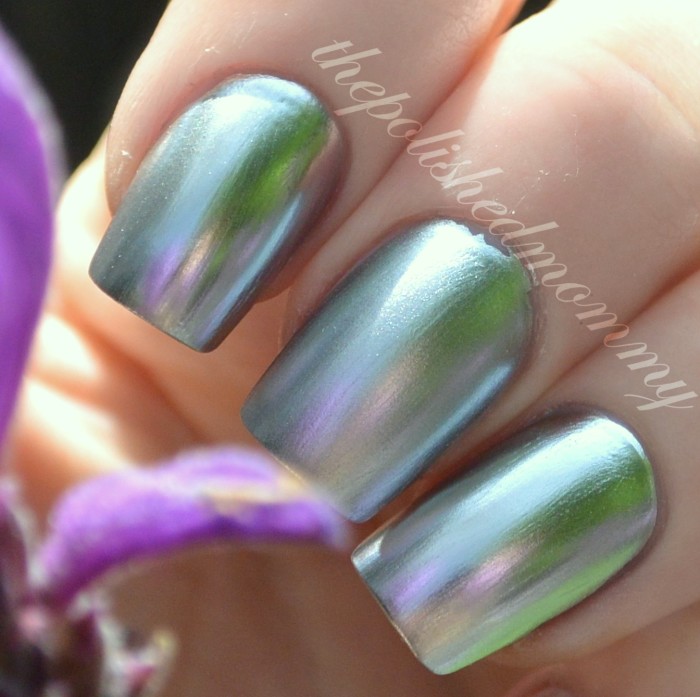 (L to R) Sally Hansen Sterling Silver, Essie No Place Like Chrome, OPI Push & Shove
Conclusion: Sterling Silver and Push & Shove are very similar, if you weren’t able to pick up P&S (now that it’s gone) then Sterling Silver is an exceptional replacement. No Place Like Chrome on the other hand, looks flat and not at all chrome-like compared to these two. If you look at the reflection photo SS and P&S have pretty clear reflections, whereas NPLC has a blurred out abstract reflection.
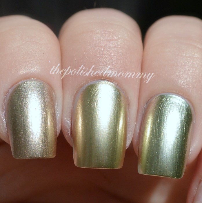 (L to R) Essie Good as Gold, SH Liquid Gold, Yellow Gold
Of these three, Liquid Gold is the most “true gold”, GaG has a slightly (very slightly) rose tint and Yellow Gold leans more green/ yellow.
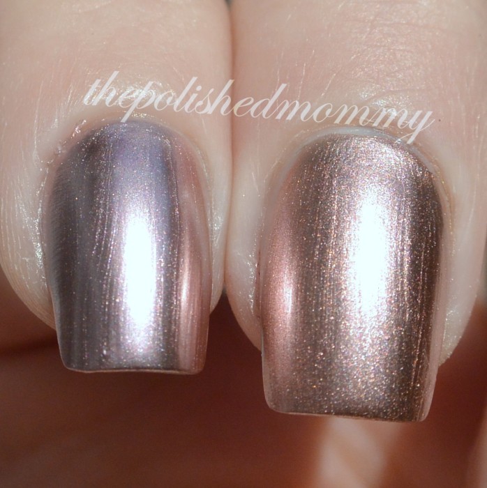 Essie Penny Talk vs Sally Hansen Rose Copper (or Pink Copper)
These two are close but PT leans more pink and Rose copper is more of a soft true copper.
So what do you think of this collection? Will you be getting any of these?


 5-Free nail lacquer by The Polished Mommy



How can I get these posish’s. If you know where I can get them ???
They were a limited edition collection so the only place to get them now is ebay, or you may get lucky and find some stock in a store.
Hola! Vivo en Aguascalientes, México y me interesa conseguir la colección Color Foil, me pueden dar información? Gracias!
This collection has been discontinued so it may be hard to find.
Want!
I love the blue and purple! I have actually heard that if you put a matte top coat then a regular top coat it will get rid of any frost or streaks. Maybe worth a try? Love the swatches!
militaryandmakeup.blogspot.com